
What is an NP-Chart?
An np-chart is an attribute data control chart that monitors the number of defective items in constant-size samples drawn from a process over time. The "n" represents the constant sample size and "p" represents the proportion defective. Unlike a p-chart which plots the proportion (fraction) of defective items, the np-chart plots the actual count of defective items — making it easier for operators to interpret because they work with whole numbers rather than decimals.
The np-chart is based on the binomial distribution, which models the probability of a specific number of successes (or failures) in a fixed number of independent trials. Each item in the sample is classified as either defective or non-defective — there is no partial classification. This binary classification distinguishes the np-chart from c-charts, which count the number of individual defects per unit.
The critical requirement for an np-chart is a constant sample size across all inspection periods. If the sample size varies, the control limits change with each sample, and a p-chart should be used instead.
How an NP-Chart Works in Manufacturing
To set up an np-chart, the quality team follows a standard process. First, define the inspection procedure and the criteria for classifying items as defective. Ensure consistent classification across all inspectors through training and clear visual standards.
Next, determine the constant sample size (n). The sample size should be large enough that defective items are expected in most samples — a common guideline is n × p-bar ≥ 5, where p-bar is the estimated proportion defective.
Collect data from at least 20 to 25 samples. For each sample, count the number of defective items (np). Calculate the overall average:
- p-bar = total defective items / total items inspected
- np-bar = n × p-bar (average number defective per sample)
Calculate control limits:
- UCL = np-bar + 3√(np-bar × (1 - p-bar))
- LCL = np-bar - 3√(np-bar × (1 - p-bar)) or 0 if negative
Plot each sample's defective count against these limits. Investigate any points above the UCL (process deterioration) and any points below the LCL (potential improvement worth understanding and standardizing).
In daily operation, the np-chart provides a simple visual indicator that shop floor personnel can maintain. The operator inspects the constant sample, counts the rejects, and plots the number. No calculations are needed at the point of use.
NP-Chart Example
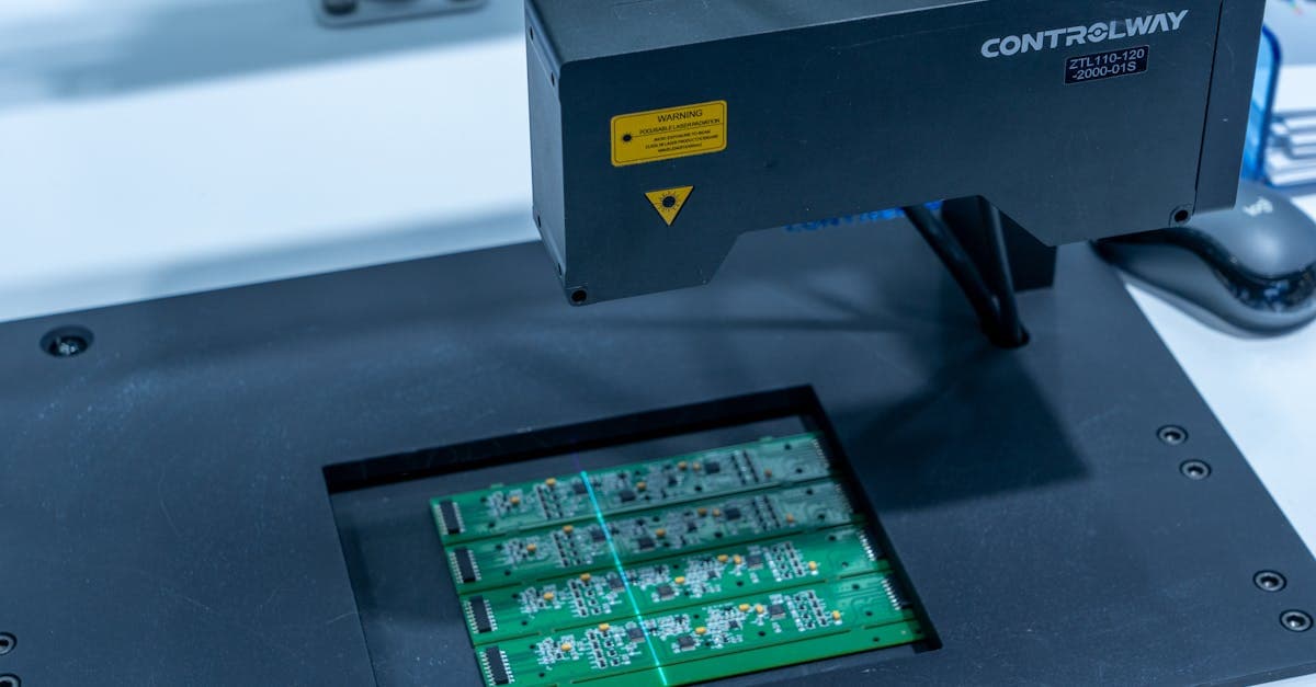
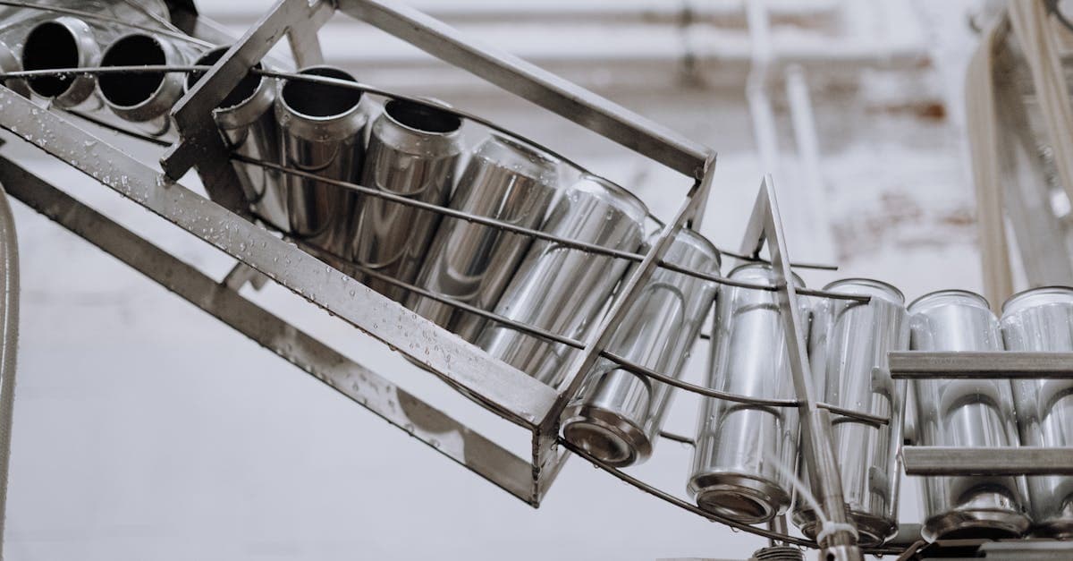
A plastic injection molding operation produces caps for beverage containers. The quality team inspects 100 caps every hour (constant n = 100) for defects including flash, short shots, sink marks, and color variation. Any cap with one or more of these defects is classified as defective.
Data from 25 hourly samples:
Total defective caps across all samples: 175 Total inspected: 2,500
- p-bar = 175 / 2,500 = 0.07
- np-bar = 100 × 0.07 = 7.0 defective caps per sample
- UCL = 7.0 + 3√(7.0 × 0.93) = 7.0 + 3 × 2.55 = 14.65 (round to 15)
- LCL = 7.0 - 7.65 = 0 (set to zero)
During production, one hourly sample shows 18 defective caps — above the UCL of 15. The operator stops the process and investigates. The root cause is a clogged cooling channel in the mold cavity, causing inconsistent cooling and surface defects. After clearing the channel, the next three samples show 5, 8, and 6 defective caps — all within control limits.
The np-chart caught the problem within one hour of onset. Without it, the cooling issue could have persisted through an entire shift, producing approximately 1,800 additional caps with an 18% defect rate instead of the normal 7%.
Why NP-Charts Matter for Production Scheduling
NP-charts provide direct, quantitative signals that impact scheduling decisions. When the number of defective items per sample increases, more rework capacity is needed. If defect counts exceed the UCL, the process stops for investigation — creating unplanned downtime that the scheduler must account for.
The simplicity of np-charts makes them particularly valuable in high-volume, fast-cycle manufacturing where scheduling is measured in hours rather than days. Scheduling software like Resource Manager DB helps planners quickly reschedule downstream operations when an np-chart triggers a process stop.
Historical np-chart data also helps schedulers estimate realistic yield rates. If the average defect rate is 7%, the scheduler should plan for producing 107 caps for every 100 needed to meet the order quantity.
Related Terms
- P-Chart — tracks proportion defective with variable sample sizes
- C-Chart — tracks count of defects per unit rather than defective units
- Control Limits — the UCL and LCL boundaries on the np-chart
FAQ
An np-chart is an attribute control chart that tracks the number of defective items in constant-size samples over time. Each inspected item is classified as either defective or non-defective, and the total count of defective items per sample is plotted against statistically calculated control limits. It provides a simple, intuitive way for operators to monitor process quality.
Both charts track defective items in samples. A p-chart plots the proportion (fraction) defective and can handle varying sample sizes because it normalizes the data. An np-chart plots the actual count of defective items and requires a constant sample size. The np-chart is preferred when sample sizes are constant because operators find whole-number counts easier to interpret than fractions.
First calculate p-bar (total defective divided by total inspected) and np-bar (sample size times p-bar). The upper control limit is np-bar plus 3 times the square root of (np-bar times (1 minus p-bar)). The lower control limit is np-bar minus the same value, or zero if the result is negative. These 3-sigma limits capture approximately 99.73% of expected variation when the process is stable.
This term is part of our Manufacturing & Production Scheduling Glossary. Learn more about quality control, scheduling, and manufacturing terminology.
Frequently Asked Questions
Ready to Transform Your Production Scheduling?
User Solutions has been helping manufacturers optimize their production schedules for over 35 years. One-time license, 5-day implementation.
User Solutions Team
Manufacturing Software Experts
User Solutions has been developing production planning and scheduling software for manufacturers since 1991. Our team combines 35+ years of manufacturing software expertise with deep industry knowledge to help factories optimize their operations.
Share this article
Related Articles

What is ABC Analysis? Definition & Manufacturing Examples
Learn what ABC analysis is in inventory management, how the Pareto principle classifies inventory, and why it matters for scheduling.
What is Acceptance Sampling? Definition & Manufacturing Examples
Learn what acceptance sampling is, how it works in manufacturing, and why it matters for production scheduling and quality control decisions.

What is Advanced Planning & Scheduling (APS)? Definition & Manufacturing Examples
Advanced Planning & Scheduling (APS) definition: software that uses algorithms to optimize production schedules against real constraints. Learn how APS works in manufacturing with examples.